
DAILY 360: B2B E-COMMERCE
S1E3: Designed a Global B2B E-commerce platform where users can buy food products in bulk, but by weight and not units
UX Design
Competitor Analysis
Developer Handoff
Tech-stack Awareness
End-to-end Problem Solving
Modular Architecture
Daily 360 is a food industry start up based out of Bengaluru. My work in MaxMedicare got me an opportunity to design this product end-to-end
The founders wanted to create an B2B e-commerce marketplace for bulk food product buying by net weight. Mainly serving the hospitality industry and the food suppliers.
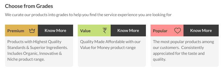
USP? User can buy by weight. User can see categories by grades.
Let's say a user wants to buy Paneer. Then based on their budget and needs, they get to choose from 'Premium', 'Value' and 'Popular' variants of paneer.
These categories were designed in a scalable way, with a custom CMS backend for the admin. Later at any point of time if it makes business sense to launch an 'Organic' grade, then it would be a matter of 5-10 mins.
This was my first big Figma project as I had only used Adobe products before. And I loved learning while doing a lot! Here's the prototype. Please follow the hints if you want to click through
Custom problems require creative solutions
Looking for inspiration, I found out about Tradeling. Positioned as a global e-commerce platform, it gives verified business users wholesale prices for bulk buying.
However, had to look for other places to understand how to structure an e-commerce site for maximum scalability. Then, I brainstormed with the devs to find out this repeatable modular structure.
The tech-stack being Drupal and Mongo.db, we planned to device HTML pre-processing and CMS functionalities to give admin users full flexibility.
The landing page explains the brand's vision and directly goes into product offerings. With an open cart at all times and a scalable vertical nav bar
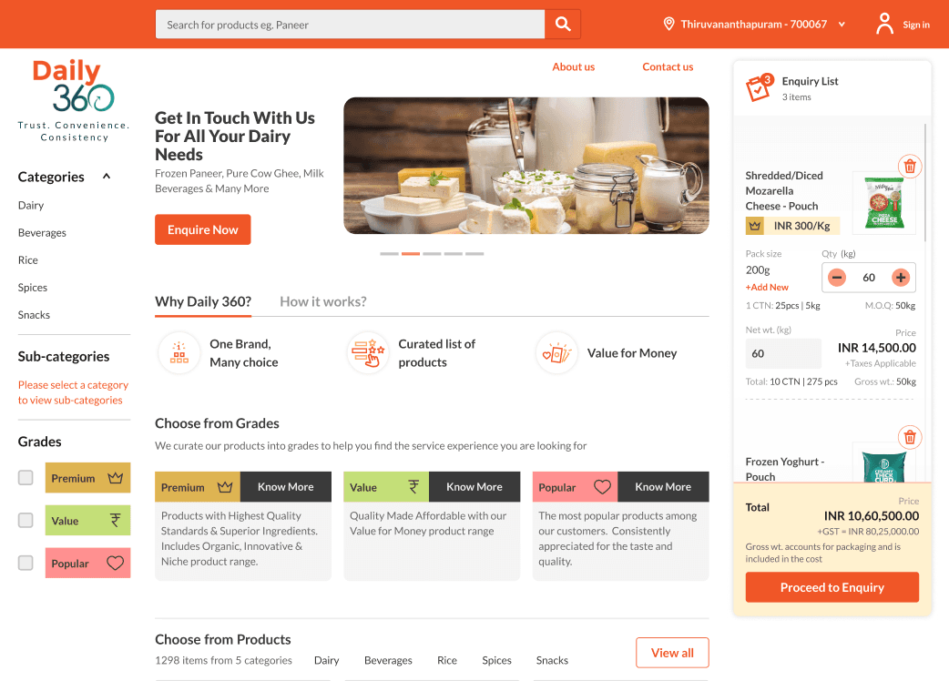
Grade filters are at the top of every page. This is a Premium Grade Category page. Under 'Premium' there is 'Dairy' and under that is 'Milk', 'Paneer', 'Cheese' etc. This way of bucketing has been done since there can be multiple grade products for Milk.
(Please ignore the banner. While writing this study I found it ugly. But the image was baked in and I couldn't change.)
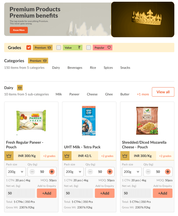
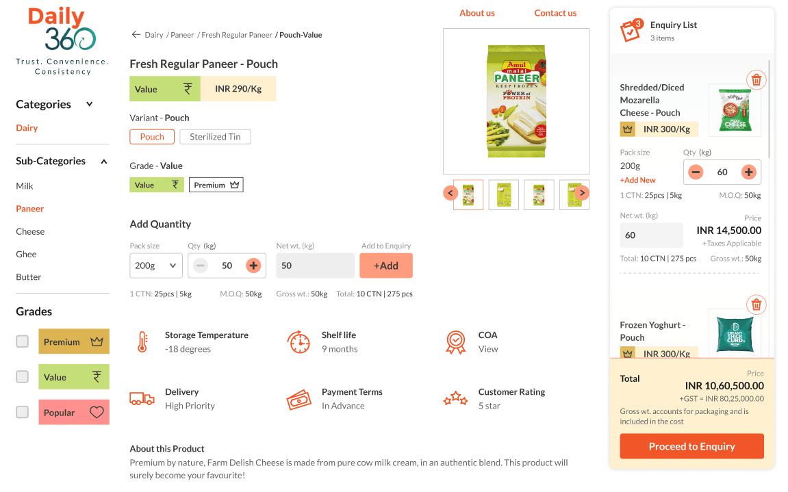
Below is an individual product page. With nav breadcrumbs at the top. Changing Variants and Grade would reload the page. Page contains COA certificate view on click.
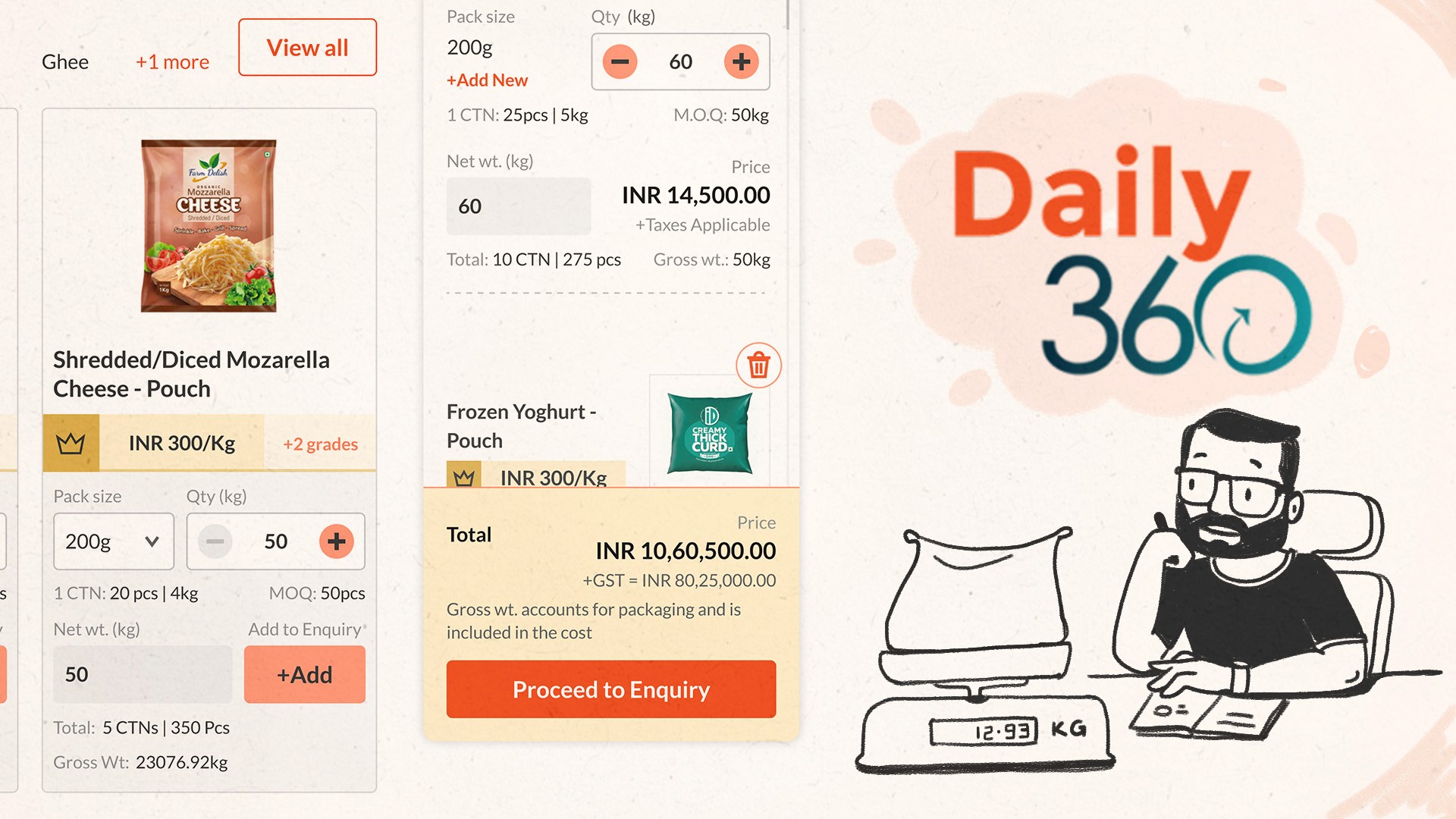
For easing bulk buying logistic, we had created the calculation of the number of Cartons and the Gross Weight which would be generated on ajax call.
Below is a product selection component that is done using mobile-first principles. 3 columns in desktop, 2 in tablet and one in mobile.
User can see price per kg, change pack size, increase or decrease kg quantity or type in the number. After checking the net weight, gross weight and carton number at the bottom, they can add to checkout.
Grade is identified with the icon badge and colour. Clicking on +2 grades would take them to Miniket Rice - Pouch page with the Value and Popular offerings.

Key takeway
This was a really fun project to work on. Sleepless nights lead to amazing insights. I got more awareness of implementation guidelines during developer handoff.
Some interaction that I had designed was requiring multiple Ajax calls and the load time kept progressively increasing. I understood the problem and chose the next best thing for the business, after consulting the developers.
This made me more sensitive towards tech-stack and implementable scalable design. Mentored by the developers in this matter, I even tried my hand at coding. The homepage grade filter boxes have been written from scratch by me from my design. It was a fun experience.
To summarize it, I learn the following key things:
Figma Components
Instance states
Simple Front-end code
Backend CMS design
Modularity
HTML Content Templates